Brand Identity design for the “O” Yoga and Pilates Medicine School, based in the UK.
The Project
Brand Identity, Graphic Design, Print
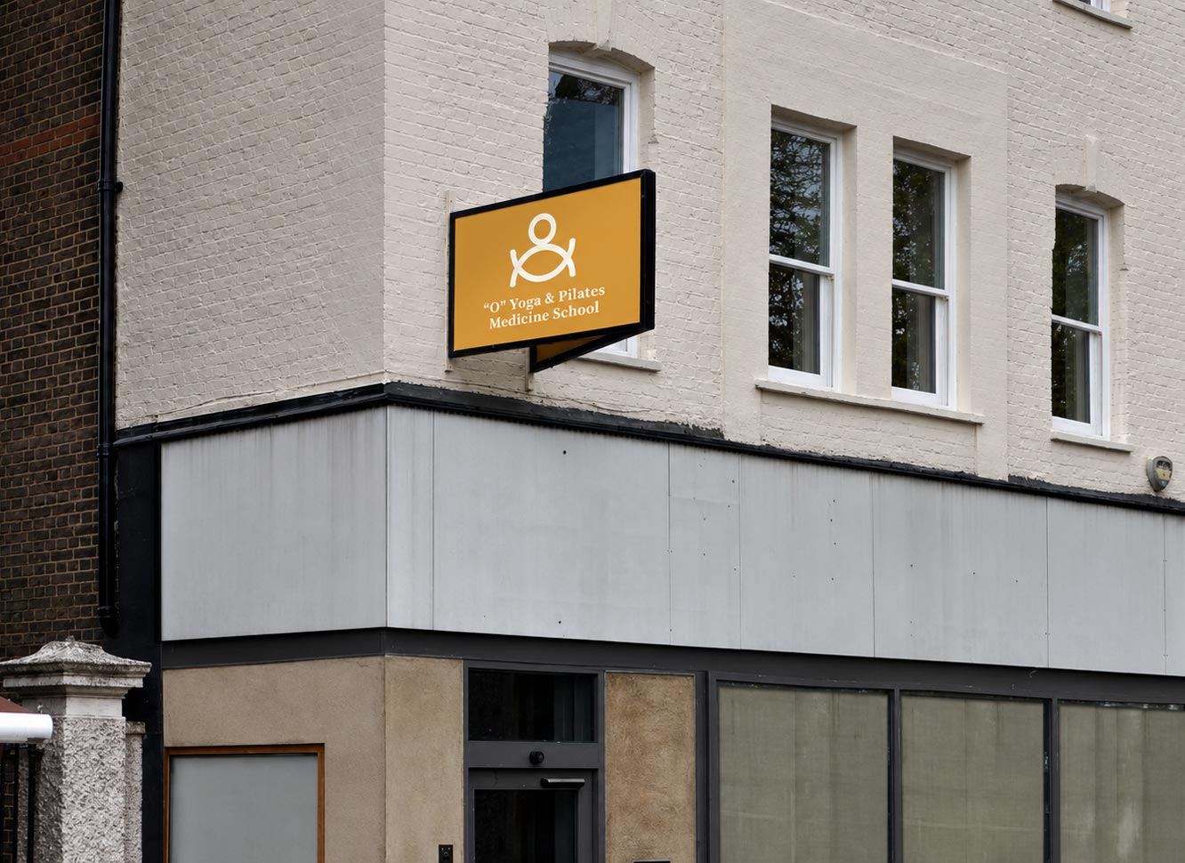
“O” Yoga is a vibrant and joyful project that I thoroughly enjoyed working on. The inspiration for the logotype symbol came from the letter “O” in the name of the school, which is an abbreviation of the mystical sound “Om” (or Ohm or Aum). This sacred sound, originating from Hinduism, holds great significance in various Dharmic religions and is closely associated with the practice of yoga.
The design of the logotype features three circles, tangential to each other, symbolizing balance, unity, and the interconnectedness of body, mind, and spirit in yoga. The circles’ equal thickness and alignment reflect the harmony and flow of energy that yoga cultivates. The colors for the logo variations were inspired by the chakras, each representing different aspects of physical, emotional, and spiritual well-being.
In addition to the logotype, I created the full corporate identity for O Yoga, including stationery, business cards, and other essential materials, ensuring a cohesive and professional visual language that aligns with the brand’s core values and mission.
Publication & Awards
Published in “Chois Gallery Vol. 31”.
Published in “Logo Talks 3”.
Published in “Fuct Art magazine, issue 23”.
Published in “Signs, Symbols & Pictograms”.